Download top and best high-quality free Line Chart PNG Transparent Images backgrounds available in various sizes. To view the full PNG size resolution click on any of the below image thumbnail.
License Info: Creative Commons 4.0 BY-NC
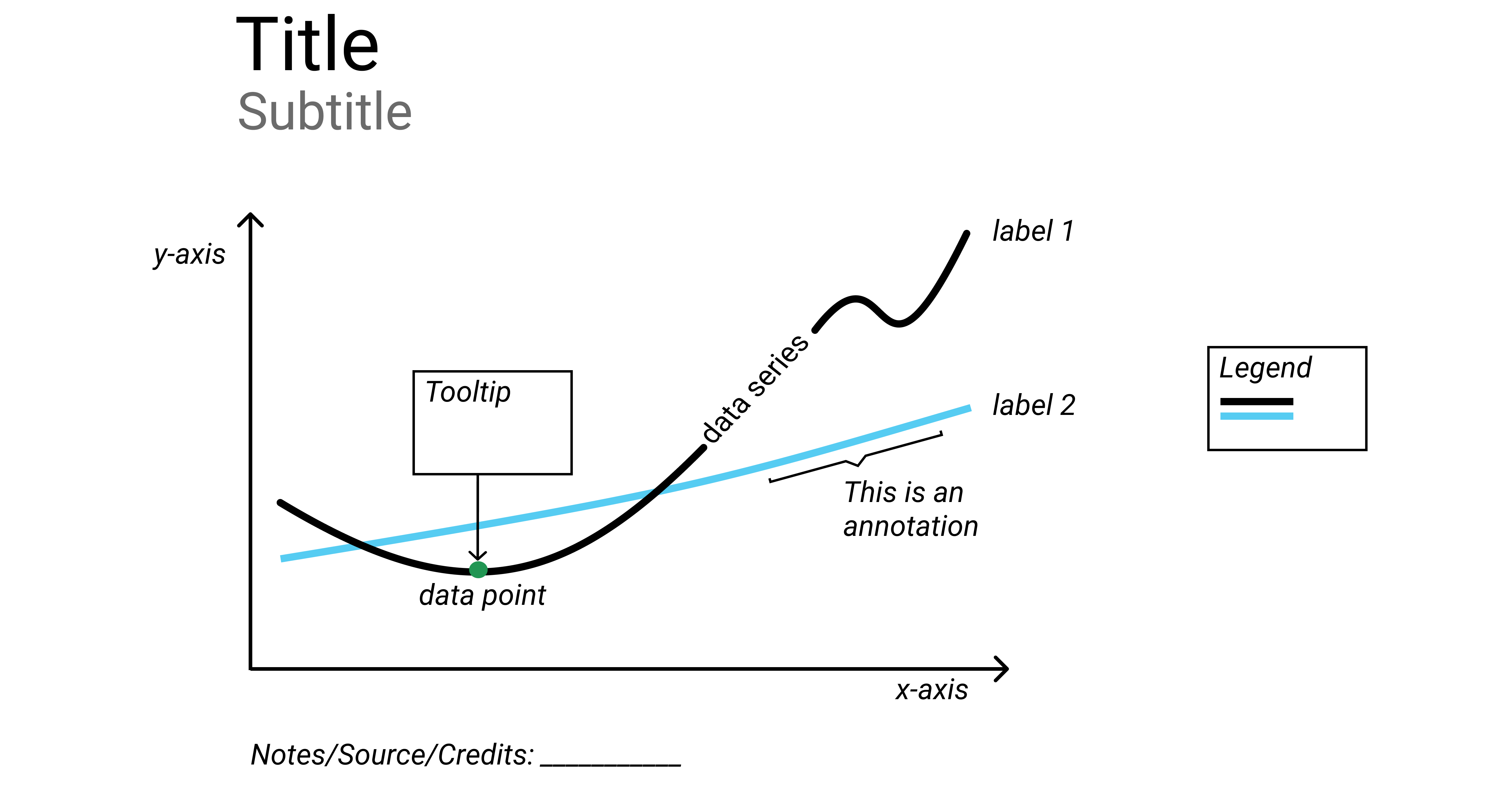
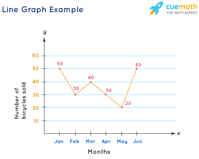
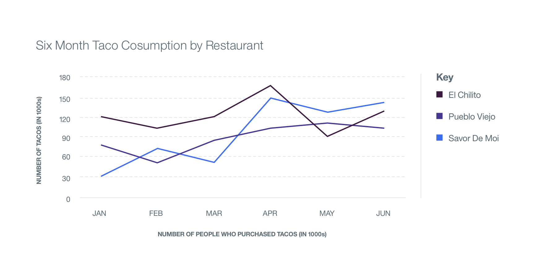
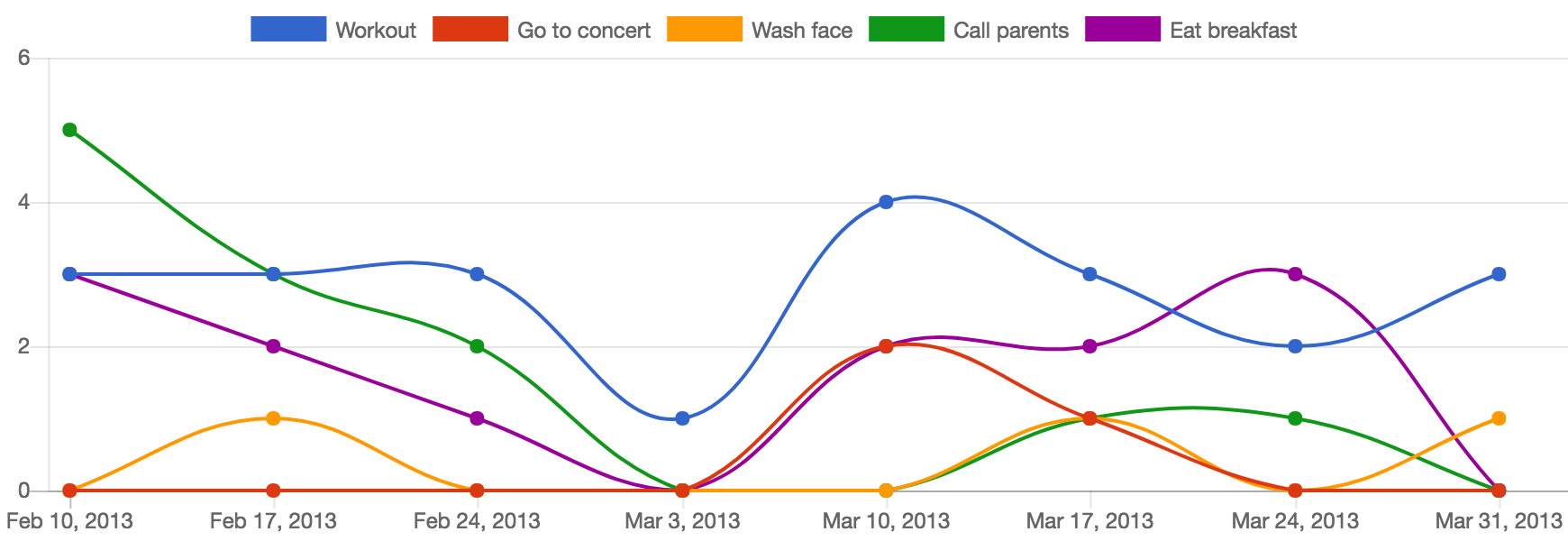
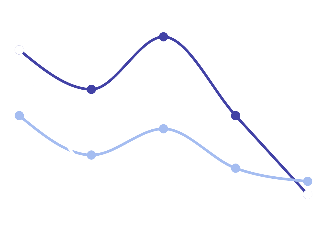
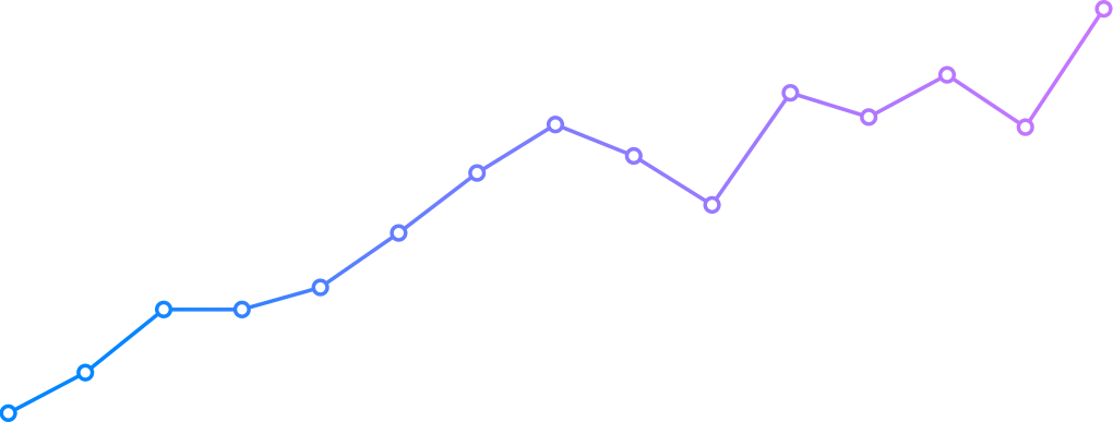
A line chart, also known as a line plot, line graph, or curve chart, shows data as a sequence of markers linked by straight line segments. It’s a simple chart that’s used in a variety of areas. The measurement points are sorted (usually by their x-axis value) and connected by straight line segments, similar to a scatter plot.
Because a line chart is frequently used to illustrate a pattern in data across time intervals – a time series – the line is usually drawn chronologically. They’re known as run charts in these situations.
Francis Hauksbee, Nicolaus Samuel Cruquius, Johann Heinrich Lambert, and William Playfair are usually attributed with some of the first known line charts.
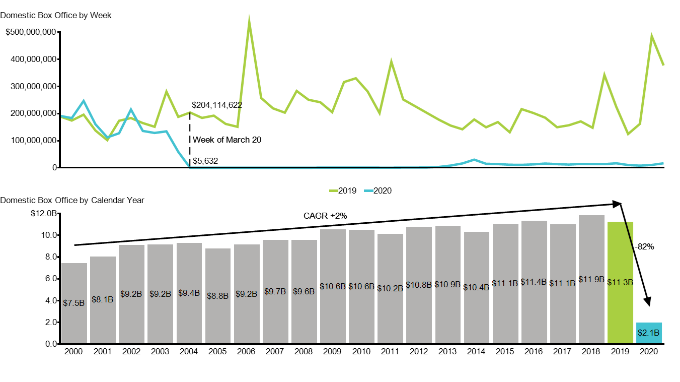
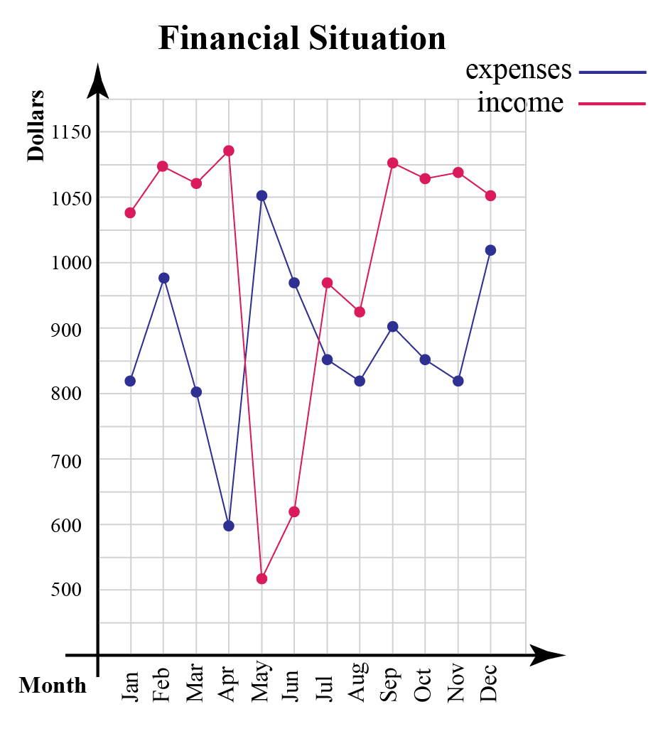
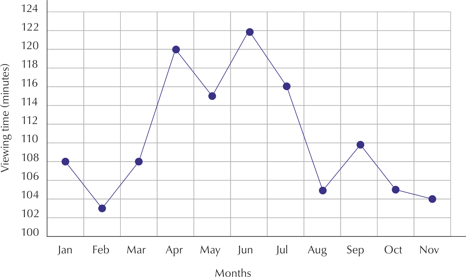
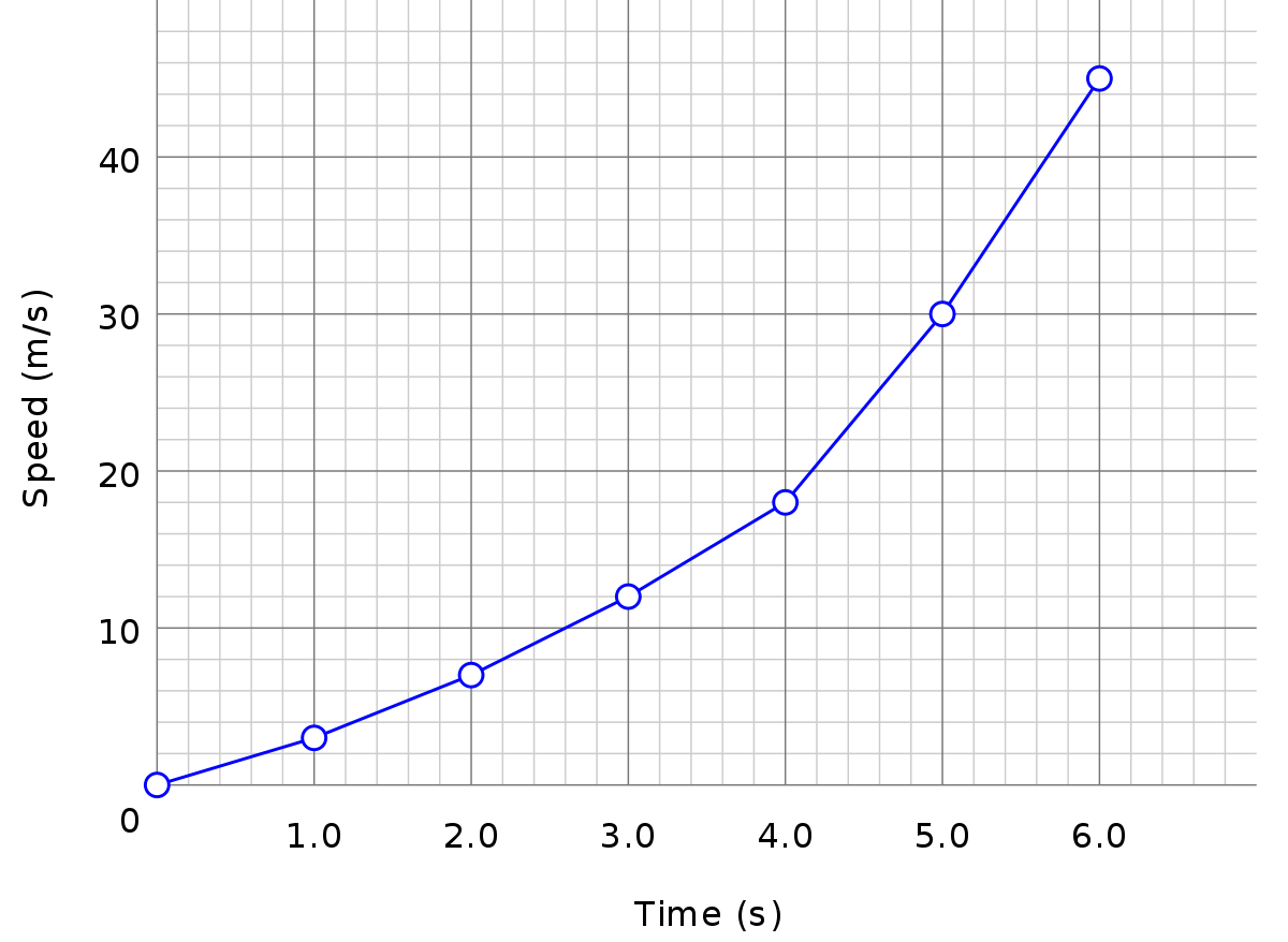
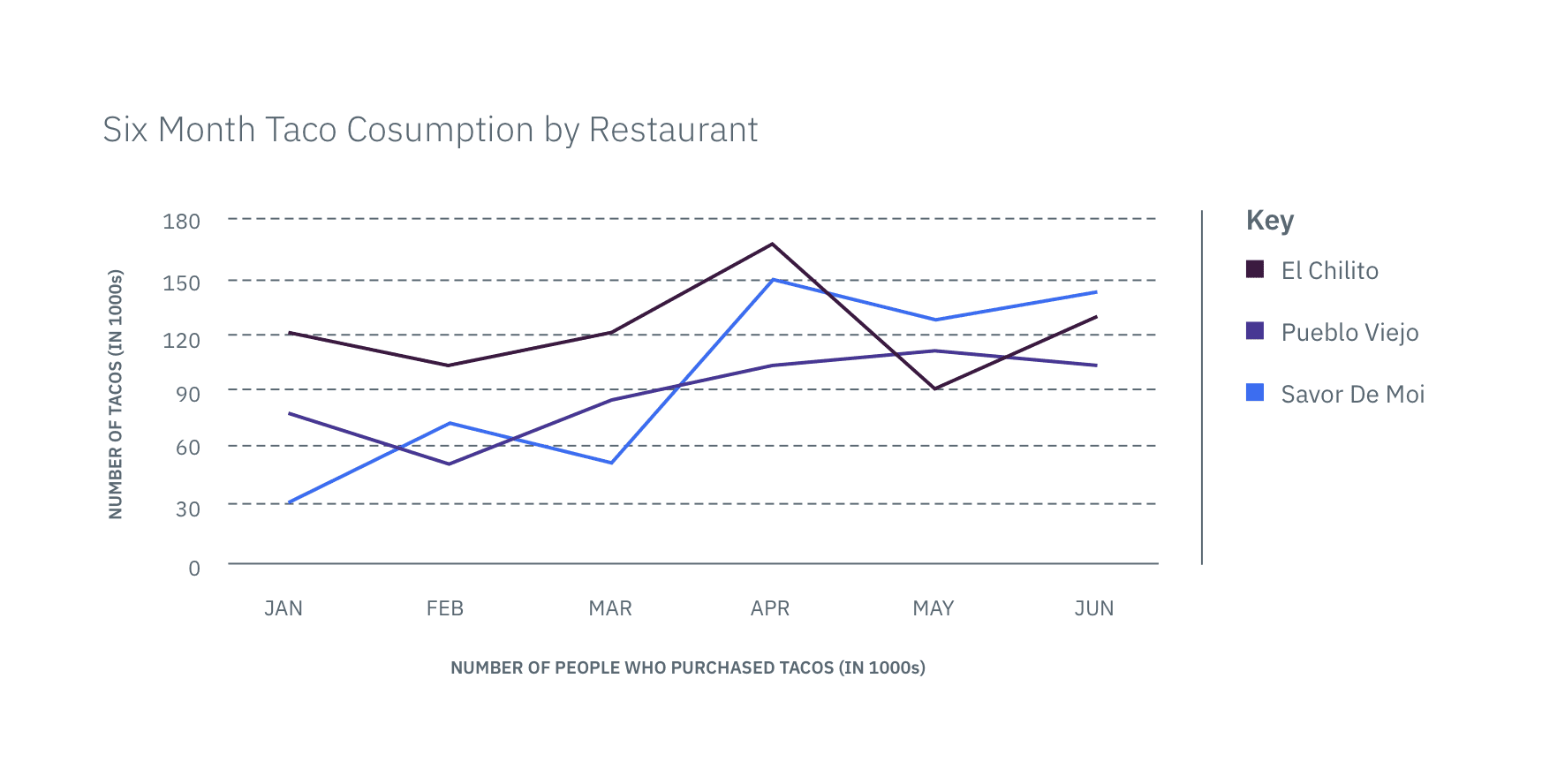
Data obtained from studies is frequently represented using graphs in the experimental sciences. For instance, if data on a body’s speed at different periods in time were collected, the data might be shown using a data table like this:
Tables are a fantastic method to display accurate figures, but they’re not always the best way to comprehend the patterns those values reflect. Because of these characteristics, the table display is sometimes mistakenly confused with the data, while it is actually just another representation of the data.
Producing a graph or line chart of Speed vs. Time can help you understand the process represented by the data in the table. The graphic on the right illustrates such a visualization.
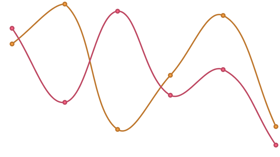
A mathematical function representing the best-fit trend of the dispersed data is frequently superimposed on charts. This layer is called a best-fit layer, and the graph that contains it is called a line graph.
It is straightforward to create a “best-fit” layer by connecting nearby data points with a set of line segments; nevertheless, such a “best-fit” is seldom an accurate depiction of the underlying scatter data’s trend.
The discontinuities in the slope of the best fit are extremely unlikely to coincide perfectly with the locations of the measurement results.
Despite the fact that the experimental error in the data is extremely unlikely to be insignificant, the curve falls perfectly across each of the data points.
The best-fit layer can highlight trends in the data in either scenario. Visual measurements of the gradient or area under the curve can also be done, leading to further inferences or findings from the data table.
A real best-fit layer should represent a continuous mathematical function whose parameters are generated using an appropriate error-minimization technique that correctly weights the error in the data values. Curve fitting features are commonly found in graphing applications and spreadsheets. Simple linear equations to more complicated quadratic, polynomial, exponential, and periodic curves are all examples of best-fit curves.
Download Line Chart PNG images transparent gallery.
-

- Line Chart Vector PNG Image HD
Resolution: 1351 × 758
Size: 32 KB
Image Format: .png
Download
-

- Line Chart Vector No Background

Resolution: 1400 × 600
Size: 9 KB
Image Format: .png
Download
-

- Line Chart Vector PNG Images HD
Resolution: 2389 × 921
Size: 297 KB
Image Format: .png
Download
-

- Line Chart Vector PNG Free Image
Resolution: 5000 × 2652
Size: 170 KB
Image Format: .png
Download
-

- Line Chart Vector PNG Image File
Resolution: 944 × 738
Size: 80 KB
Image Format: .png
Download
-

- Line Chart Vector Background PNG
Resolution: 926 × 1043
Size: 56 KB
Image Format: .png
Download
-

- Line Chart Vector PNG Background
Resolution: 697 × 559
Size: 23 KB
Image Format: .png
Download
-

- Line Chart PNG Free Image
Resolution: 910 × 512
Size: 50 KB
Image Format: .png
Download
-

- Line Chart PNG Photos
Resolution: 1024 × 676
Size: 13 KB
Image Format: .png
Download
-

- Line Chart Silhouette
Resolution: 980 × 824
Size: 42 KB
Image Format: .png
Download
-

- Line Chart Silhouette PNG Photo

Resolution: 1000 × 1000
Size: 17 KB
Image Format: .png
Download
-

- Line Chart Silhouette PNG Photos
Resolution: 980 × 926
Size: 9 KB
Image Format: .png
Download
-

- Line Chart Background PNG
Resolution: 1129 × 710
Size: 12 KB
Image Format: .png
Download
-

- Line Chart Silhouette Transparent

Resolution: 1405 × 1208
Size: 30 KB
Image Format: .png
Download
-

- Line Chart
Resolution: 1700 × 690
Size: 481 KB
Image Format: .png
Download
-

- Line Chart Silhouette PNG

Resolution: 1526 × 1526
Size: 36 KB
Image Format: .png
Download
-

- Line Chart PNG
Resolution: 958 × 817
Size: 114 KB
Image Format: .png
Download
-

- Line Chart PNG Pic
Resolution: 1555 × 925
Size: 77 KB
Image Format: .png
Download
-

- Line Chart Vector

Resolution: 3279 × 2902
Size: 56 KB
Image Format: .png
Download
-

- Line Chart PNG File
Resolution: 714 × 615
Size: 140 KB
Image Format: .png
Download
-

- Line Chart PNG Image

Resolution: 877 × 377
Size: 6 KB
Image Format: .png
Download
-

- Line Chart PNG Photo
Resolution: 844 × 750
Size: 135 KB
Image Format: .png
Download
-

- Line Chart PNG Cutout
Resolution: 1746 × 888
Size: 96 KB
Image Format: .png
Download
-

- Line Chart PNG Images
Resolution: 1740 × 600
Size: 125 KB
Image Format: .png
Download
-

- Line Chart Silhouette PNG Pic
Resolution: 944 × 980
Size: 29 KB
Image Format: .png
Download
-

- Line Chart Vector PNG

Resolution: 658 × 658
Size: 14 KB
Image Format: .png
Download
-

- Line Chart Transparent
Resolution: 2487 × 1611
Size: 115 KB
Image Format: .png
Download
-

- Line Chart PNG Clipart
Resolution: 1485 × 1014
Size: 161 KB
Image Format: .png
Download
-

- Line Chart PNG Picture
Resolution: 1024 × 548
Size: 91 KB
Image Format: .png
Download
-

- Line Chart PNG HD Image
Resolution: 1006 × 435
Size: 21 KB
Image Format: .png
Download
-

- Line Chart PNG Image HD
Resolution: 1143 × 774
Size: 19 KB
Image Format: .png
Download
-

- Line Chart No Background
Resolution: 1200 × 878
Size: 48 KB
Image Format: .png
Download
-

- Line Chart PNG Images HD
Resolution: 850 × 466
Size: 114 KB
Image Format: .png
Download
-

- Line Chart Vector PNG Pic
Resolution: 876 × 659
Size: 285 KB
Image Format: .png
Download
-

- Line Chart Vector PNG File
Resolution: 1440 × 1256
Size: 51 KB
Image Format: .png
Download
-

- Line Chart Vector PNG Image
Resolution: 1200 × 600
Size: 31 KB
Image Format: .png
Download
-

- Line Chart Vector PNG Photo
Resolution: 1560 × 1020
Size: 98 KB
Image Format: .png
Download
-

- Line Chart Silhouette PNG File

Resolution: 865 × 720
Size: 32 KB
Image Format: .png
Download
-

- Line Chart Silhouette PNG Image
Resolution: 981 × 806
Size: 26 KB
Image Format: .png
Download
-

- Line Chart Vector PNG Cutout
Resolution: 1020 × 387
Size: 11 KB
Image Format: .png
Download
-

- Line Chart Silhouette PNG Cutout
Resolution: 900 × 849
Size: 27 KB
Image Format: .png
Download
-

- Line Chart Silhouette PNG Images
Resolution: 980 × 858
Size: 15 KB
Image Format: .png
Download
-

- Line Chart Vector PNG Images
Resolution: 1274 × 1280
Size: 77 KB
Image Format: .png
Download
-
- Line Chart Vector PNG Photos
Resolution: 1746 × 888
Size: 20 KB
Image Format: .png
Download
-

- Line Chart Vector Transparent

Resolution: 715 × 715
Size: 27 KB
Image Format: .png
Download
-

- Line Chart Vector PNG Clipart
Resolution: 1138 × 733
Size: 32 KB
Image Format: .png
Download
-

- Line Chart Vector PNG Picture
Resolution: 1280 × 934
Size: 62 KB
Image Format: .png
Download
-

- Line Chart PNG Image File
Resolution: 1337 × 950
Size: 26 KB
Image Format: .png
Download
-

- Line Chart Vector PNG HD Image
Resolution: 914 × 553
Size: 21 KB
Image Format: .png
Download