Download top and best high-quality free AEW Logo PNG Transparent Images backgrounds available in various sizes. To view the full PNG size resolution click on any of the below image thumbnail.
License Info: Creative Commons 4.0 BY-NC
All Elite Wrestling (AEW) is a professional wrestling promotion that was founded in 2019, and it has quickly become one of the most popular wrestling organizations in the world. One of the key elements of the AEW brand is its logo, which has become synonymous with the promotion. In this article, we will explore the AEW logo and its meaning, along with its history and design.
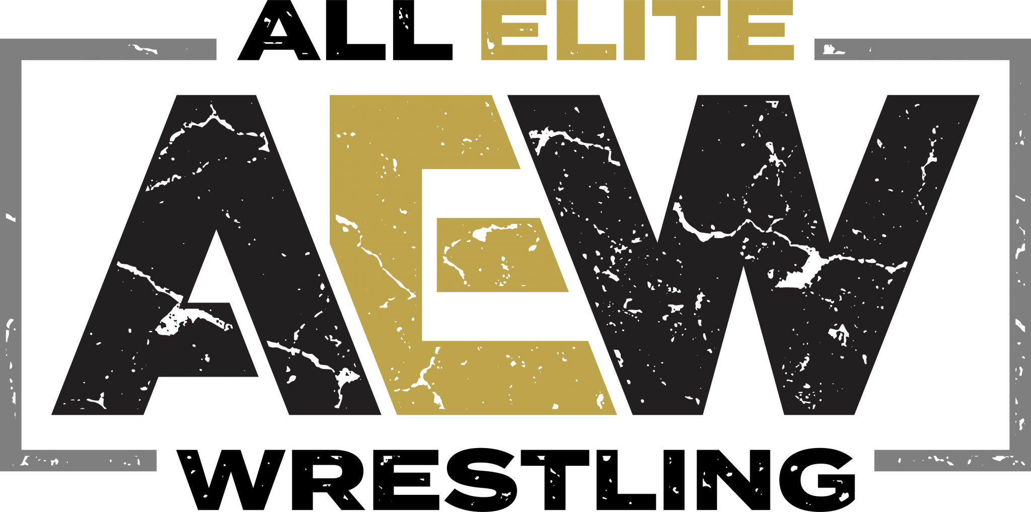
The AEW logo features a bold, stylized lettering that spells out the name of the organization. The fonts themselves have a clean, modern look that is consistent with the brand’s overall aesthetic. The letters are arranged in a slightly curved formation that creates motion and energy, reflecting the excitement and drama of professional wrestling.
The colors of the AEW logo are black and gold, which is a classic combination that gives the logo a timeless feel. The black lettering is outlined in gold, creating a clear contrast that makes the logo stand out. This color scheme is also used throughout the AEW brand, including on promotional materials, merchandise, and the company’s official website.
The AEW logo was designed by the prominent graphic designer and branding expert, Kevin Sullivan. Sullivan has worked with many high-profile clients over the course of his career, including the NBA and the UFC. He was tasked with creating a logo that captured the spirit and character of AEW, and he succeeded brilliantly.
According to Sullivan, he drew inspiration for the AEW logo from both medieval and modern font styles. He combined classic elements with contemporary design principles to create a logo that is both timeless and forward-thinking. The curved formation of the letters was inspired by the arc of a wrestler’s body in motion, while the gold outline represents the championship belts that are awarded to wrestlers in the AEW organization.
The symbolism of the AEW logo is also significant. The letters themselves represent the organization’s core values – striving for excellence, innovation, and integrity. The curved formation of the letters represents movement and momentum, suggesting that AEW is a dynamic and constantly evolving organization. The gold outline of the logo represents power, prestige, and success, reflecting the aspirations of the AEW brand.
The history of the AEW logo is relatively short but has already made an impact on the world of professional wrestling. The logo was first unveiled in January 2019, shortly after the formation of the organization. It was an instant hit with fans, who praised its sleek and modern design. The logo has since become one of the most recognizable symbols in wrestling, used on everything from t-shirts to championship belts.
The AEW logo has also undergone several iterations over the years. In 2020, the promotion introduced a new version of the logo, which featured a sleeker design and a more prominent use of the gold outline. This new version was designed to reflect the organization’s growing success and to embody the principles of the AEW brand more fully.
AEW logo is a powerful symbol of one of the most exciting and innovative wrestling promotions in the world. Its bold, modern design and powerful symbolism capture the spirit and character of AEW, representing its values and aspirations. Whether you are a fan of professional wrestling or simply appreciate great design, the AEW logo is a potent symbol of excellence that is sure to endure for many years to come.
Download AEW Logo PNG images transparent gallery
- AEW Logo PNG Images HD
Resolution: 420 × 480
Size: 270 KB
Image Format: .png
Download
- AEW Logo PNG Images
Resolution: 600 × 257
Size: 106 KB
Image Format: .png
Download
- AEW Logo PNG Photo
Resolution: 1280 × 501
Size: 706 KB
Image Format: .png
Download
- AEW Logo PNG Photos
Resolution: 2016 × 396
Size: 198 KB
Image Format: .png
Download
- AEW Logo PNG Pic
Resolution: 3000 × 2398
Size: 151 KB
Image Format: .png
Download
- AEW Logo PNG Picture
Resolution: 3000 × 590
Size: 137 KB
Image Format: .png
Download
- AEW Logo PNG
Resolution: 250 × 250
Size: 12 KB
Image Format: .png
Download
- AEW Logo Transparent
Resolution: 5000 × 3786
Size: 408 KB
Image Format: .png
Download
- AEW Logo
Resolution: 4000 × 2000
Size: 165 KB
Image Format: .png
Download
- AEW Logo Background PNG
Resolution: 4000 × 2000
Size: 165 KB
Image Format: .png
Download
- AEW Logo No Background
Resolution: 139 × 70
Size: 15 KB
Image Format: .png
Download
- AEW Logo PNG Background
Resolution: 139 × 70
Size: 15 KB
Image Format: .png
Download
- AEW Logo PNG Clipart
Resolution: 1163 × 687
Size: 536 KB
Image Format: .png
Download
- AEW Logo PNG Cutout
Resolution: 1441 × 625
Size: 46 KB
Image Format: .png
Download
- AEW Logo PNG File
Resolution: 2000 × 496
Size: 107 KB
Image Format: .png
Download
- AEW Logo PNG Free Image
Resolution: 300 × 179
Size: 13 KB
Image Format: .png
Download
- AEW Logo PNG HD Image
Resolution: 2048 × 1017
Size: 656 KB
Image Format: .png
Download
- AEW Logo PNG Image File
Resolution: 4000 × 2000
Size: 165 KB
Image Format: .png
Download
- AEW Logo PNG Image HD
Resolution: 4000 × 2000
Size: 165 KB
Image Format: .png
Download
- AEW Logo PNG Image
Resolution: 964 × 1024
Size: 44 KB
Image Format: .png
Download
