Download top and best high-quality free Fall Guys Logo PNG Transparent Images backgrounds available in various sizes. To view the full PNG size resolution click on any of the below image thumbnail.
License Info: Creative Commons 4.0 BY-NC
Fall Guys: Ultimate Knockout has taken the gaming community by storm with its fun and engaging gameplay. This multiplayer game developed by Mediatonic has reached millions of players worldwide. What makes it more interesting is its unique and colorful art style, which is reflected in its logo. In this article, we will explore the Fall Guys logo, its design, meaning, and significance.
The Design of Fall Guys Logo
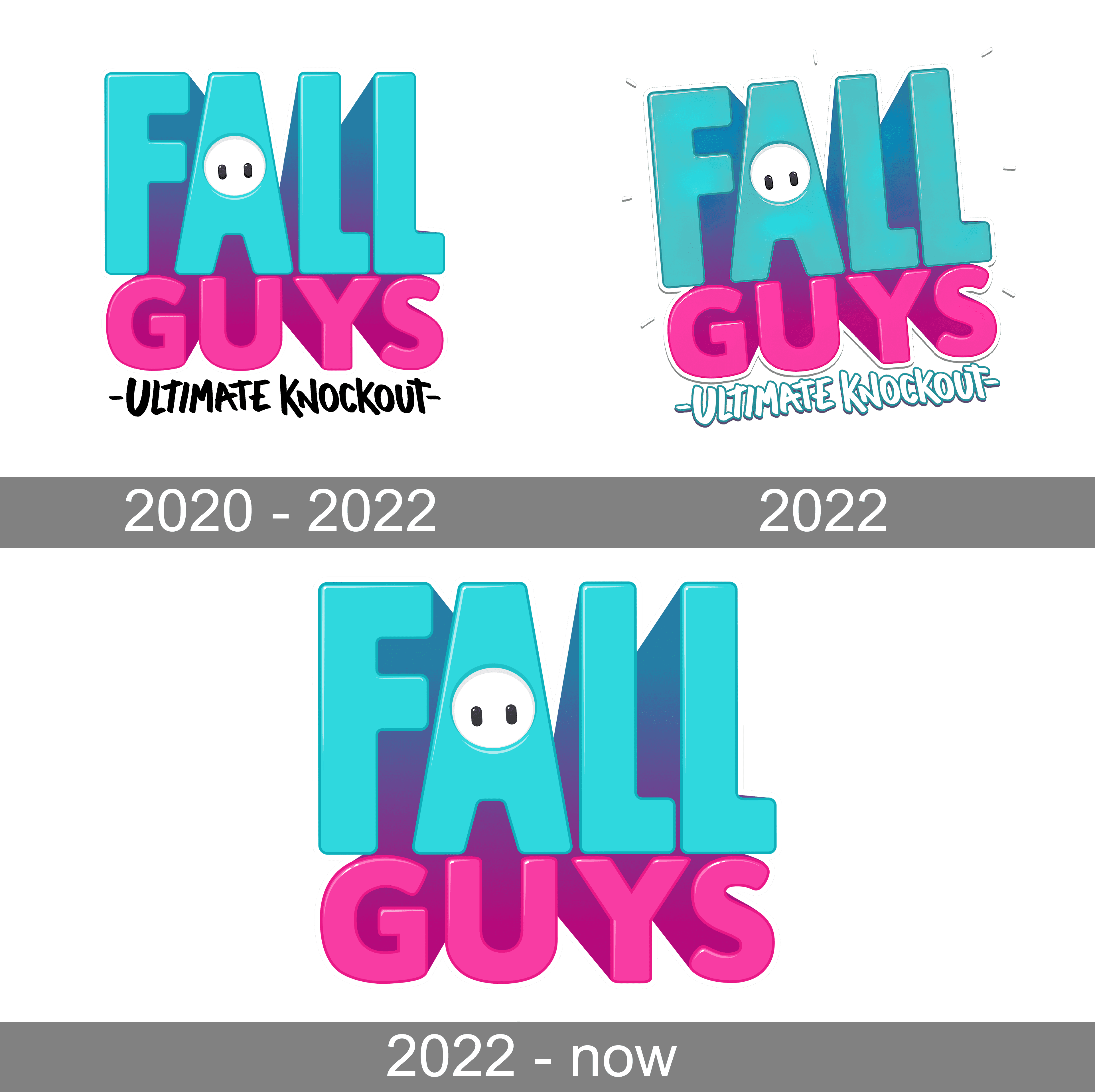
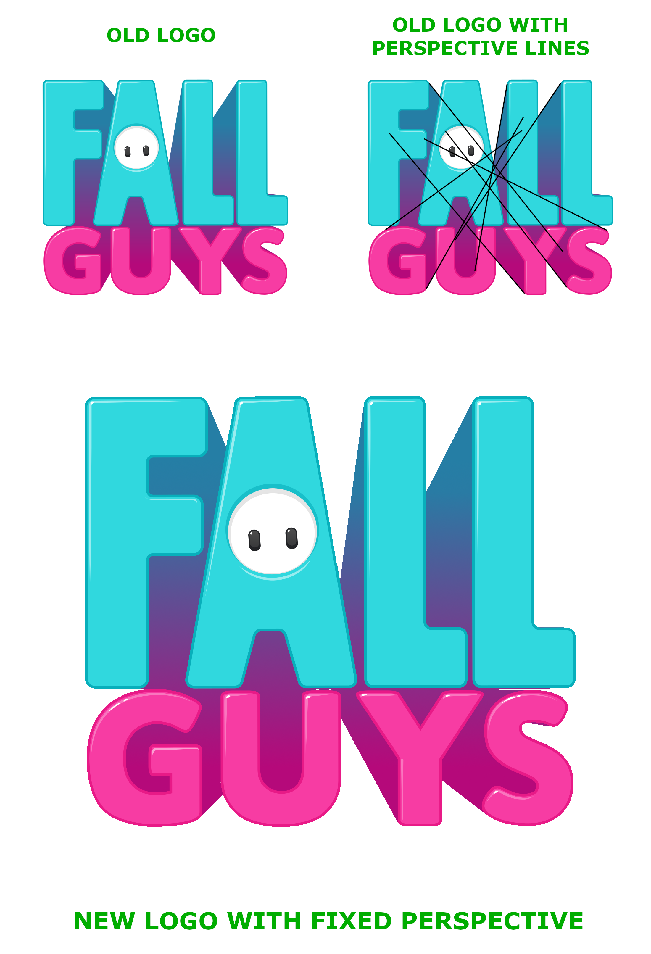
At first glance, the logo of Fall Guys seems straightforward and simple. It uses a cartoony font with a bold and colorful design. The primary color scheme of the logo is a bright shade of yellow, purple, and pink. The letters of the logo are well-spaced and easy to read. The “A” in the “Fall” is replaced with the image of a bean, which is one of the playable characters in the game.
Another exciting aspect of the logo is that it uses gradients, enhancing the overall look and feel of the image. The gradient gives a depth perception to the logo, making it more visually appealing.
What Does The Fall Guys Logo Represent?
The Fall Guys logo aims to represent the game’s concept and how it appeals to players. The color scheme denotes a fun, cheerful, and exciting game. The yellow color represents happiness, joy, and positivity, while purple and pink represent an element of playfulness and fun.
The bean figure in the logo represents the game’s character, which is the main attraction of Fall Guys. The bean is a lovable and appealing character that instantly connects with the audience. Overall, the logo successfully portrays the game’s concept, which is about playing and having fun with others.
The Significance of Fall Guys Logo
The logo of Fall Guys has a significant impact on the game’s success. It creates an instant connection with the audience, making it more memorable and recognizable. The logo is versatile, which means it can be used in marketing, merchandise, and social media. Moreover, the Fall Guys logo has become a pop-culture icon, featuring in several memes and social media posts.
Mediatonic has successfully created a logo that is both visually appealing and memorable. The design, color scheme, and concept blend perfectly to deliver a cohesive and engaging image.
Conclusion
The Fall Guys logo is an integral part of the game’s brand identity. It represents the game’s concept and appeals to the target audience: casual gamers. With its playful design, unique character, and bright color scheme, the logo sets the tone for the game’s overall experience. The logo has already become a pop-culture icon and will continue to capture the audience’s attention in the future. Overall, the Fall Guys logo is more than just an image. It’s a representation of fun, joy, and excitement.
Download Fall Guys Logo PNG images transparent gallery
- Fall Guys Logo PNG Photos
Resolution: 512 × 512
Size: 184 KB
Image Format: .png
Download
- Fall Guys Logo PNG Pic
Resolution: 466 × 131
Size: 10 KB
Image Format: .png
Download
- Fall Guys Logo PNG Picture
Resolution: 300 × 264
Size: 13 KB
Image Format: .png
Download
- Fall Guys Logo PNG
Resolution: 1413 × 1381
Size: 116 KB
Image Format: .png
Download
- Fall Guys Logo Transparent
Resolution: 3840 × 3831
Size: 506 KB
Image Format: .png
Download
- Fall Guys Logo
Resolution: 501 × 438
Size: 16 KB
Image Format: .png
Download
- Fall Guys Logo Background PNG
Resolution: 900 × 495
Size: 365 KB
Image Format: .png
Download
- Fall Guys Logo No Background
Resolution: 500 × 252
Size: 31 KB
Image Format: .png
Download
- Fall Guys Logo PNG Background
Resolution: 2200 × 3224
Size: 848 KB
Image Format: .png
Download
- Fall Guys Logo PNG Clipart
Resolution: 3840 × 2160
Size: 729 KB
Image Format: .png
Download
- Fall Guys Logo PNG Cutout
Resolution: 1920 × 1080
Size: 600 KB
Image Format: .png
Download
- Fall Guys Logo PNG File
Resolution: 252 × 300
Size: 22 KB
Image Format: .png
Download
- Fall Guys Logo PNG Free Image
Resolution: 2056 × 1157
Size: 86 KB
Image Format: .png
Download
- Fall Guys Logo PNG HD Image
Resolution: 1500 × 708
Size: 61 KB
Image Format: .png
Download
- Fall Guys Logo PNG Image File
Resolution: 3464 × 3464
Size: 992 KB
Image Format: .png
Download
- Fall Guys Logo PNG Image HD
Resolution: 3840 × 2160
Size: 483 KB
Image Format: .png
Download
- Fall Guys Logo PNG Image
Resolution: 1909 × 1189
Size: 85 KB
Image Format: .png
Download
- Fall Guys Logo PNG Images HD
Resolution: 913 × 200
Size: 150 KB
Image Format: .png
Download
- Fall Guys Logo PNG Images
Resolution: 570 × 708
Size: 9 KB
Image Format: .png
Download
- Fall Guys Logo PNG Photo
Resolution: 512 × 512
Size: 230 KB
Image Format: .png
Download
