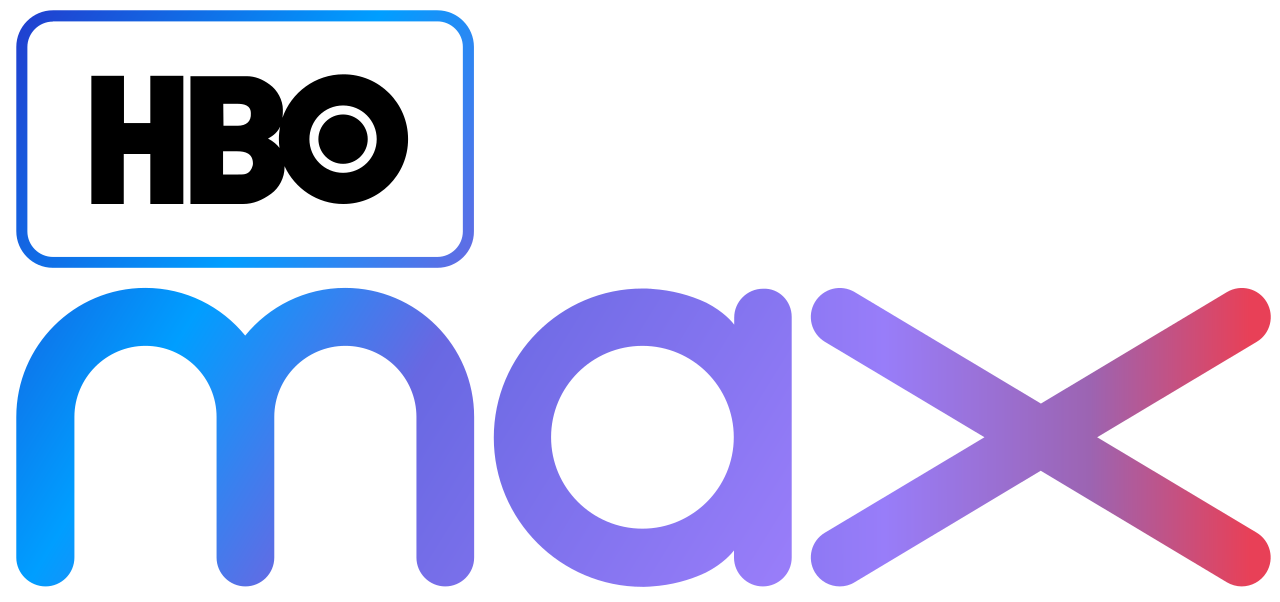
Download top and best high-quality free HBO Max Logo PNG Transparent Images backgrounds available in various sizes. To view the full PNG size resolution click on any of the below image thumbnail.
License Info: Creative Commons 4.0 BY-NC
HBO Max is a premium streaming service that offers a wide selection of movies, TV shows, and original programming. It is part of the larger HBO family and comes with a unique and recognizable logo that represents the brand. In this article, we will take a closer look at the HBO Max logo, its design, and the story behind it.
The HBO Max logo is a sleek and modern design that is instantly recognizable. It features a simple and elegant font with a small icon on top of the letters “HBO.” The icon is a square with a gradient color design that transitions from magenta to purple. The letter “M” is prominently placed inside the square and is also colored in the same gradient.
The square icon represents the streaming aspect of HBO Max, while the letters “HBO” represent the longstanding brand that has been a leader in premium content for decades. The linear design of the font and the gradient coloring of the square give a sense of motion and energy, making it a perfect fit for a streaming service.
The logo was designed by the branding agency Mocean, which has worked with HBO in the past. Mocean was tasked with creating a logo that would not only represent HBO Max but also differentiate it from the existing HBO brand. The team at Mocean took inspiration from the brand’s iconic “static” intro that plays before every show and translated it into a modern design that represents the streaming era.
The final version of the logo went through several iterations before it was approved. The designers played with different fonts, color combinations, and icon designs before settling on the current version. The result is a logo that perfectly captures the essence of HBO Max.
One of the unique features of the HBO Max logo is its use of color. The gradient design of the square is not only visually appealing, but it also represents the diversity and range of content available on the streaming service. HBO Max offers a wide variety of content, from classic movies and TV shows to new and original programming. The gradient design reflects this diversity and tells viewers that there is something for everyone on HBO Max.
The font used in the HBO Max logo is also significant. The linear design of the font is intended to represent the modern and streamlined nature of the streaming service. It is easy to read and recognizable, making it perfect for branding purposes.
The HBO Max logo has been well-received by fans and critics alike. It has become an instantly recognizable symbol of the brand and has helped to differentiate HBO Max from its competitors. The logo has also been used in various marketing campaigns and has been featured prominently in trailers and commercials.
HBO Max logo is a modern and elegant design that perfectly represents the brand. It is a symbol of the streaming era, with its gradient square representing the diversity and range of content available on the service. The linear font and modern design reflect the streamlined nature of the streaming service and make it a perfect fit for branding purposes. The logo is a testament to the work of the branding agency Mocean and is sure to become a lasting symbol of the HBO Max brand for years to come.


