Download top and best high-quality free Google Play Logo PNG Transparent Images backgrounds available in various sizes. To view the full PNG size resolution click on any of the below image thumbnail.
License Info: Creative Commons 4.0 BY-NC
If you are an Android device user, you are likely familiar with the Google Play logo. This logo is commonly seen on your device and is the gateway to a vast library of apps, games, music, movies, books, and more. In this article, we will take a closer look at the Google Play logo and what it represents.
What is Google Play?
Firstly, let’s talk about what Google Play is. Google Play is the official app store and digital entertainment hub for Android devices. It was launched in March 2012 and has since become the go-to destination for Android users to download and access apps, music, movies, TV shows, books, and more.
The Google Play logo
The Google Play logo is instantly recognizable and has become a ubiquitous symbol to Android users. The Google Play logo features a stylized triangle with a series of multicolored arcs, resembling a set of three-dimensional sound waves. The transparent colors range from blue to green to yellow to red and back to blue, symbolizing the various types of content available on Google Play.
The overall shape of the logo is a modified equilateral triangle, indicating a sense of unity between the different multimedia services offered by Google. The triangle is also a nod to the “play” button symbol displayed on many electronic devices and interfaces.
The Evolution of the Google Play logo
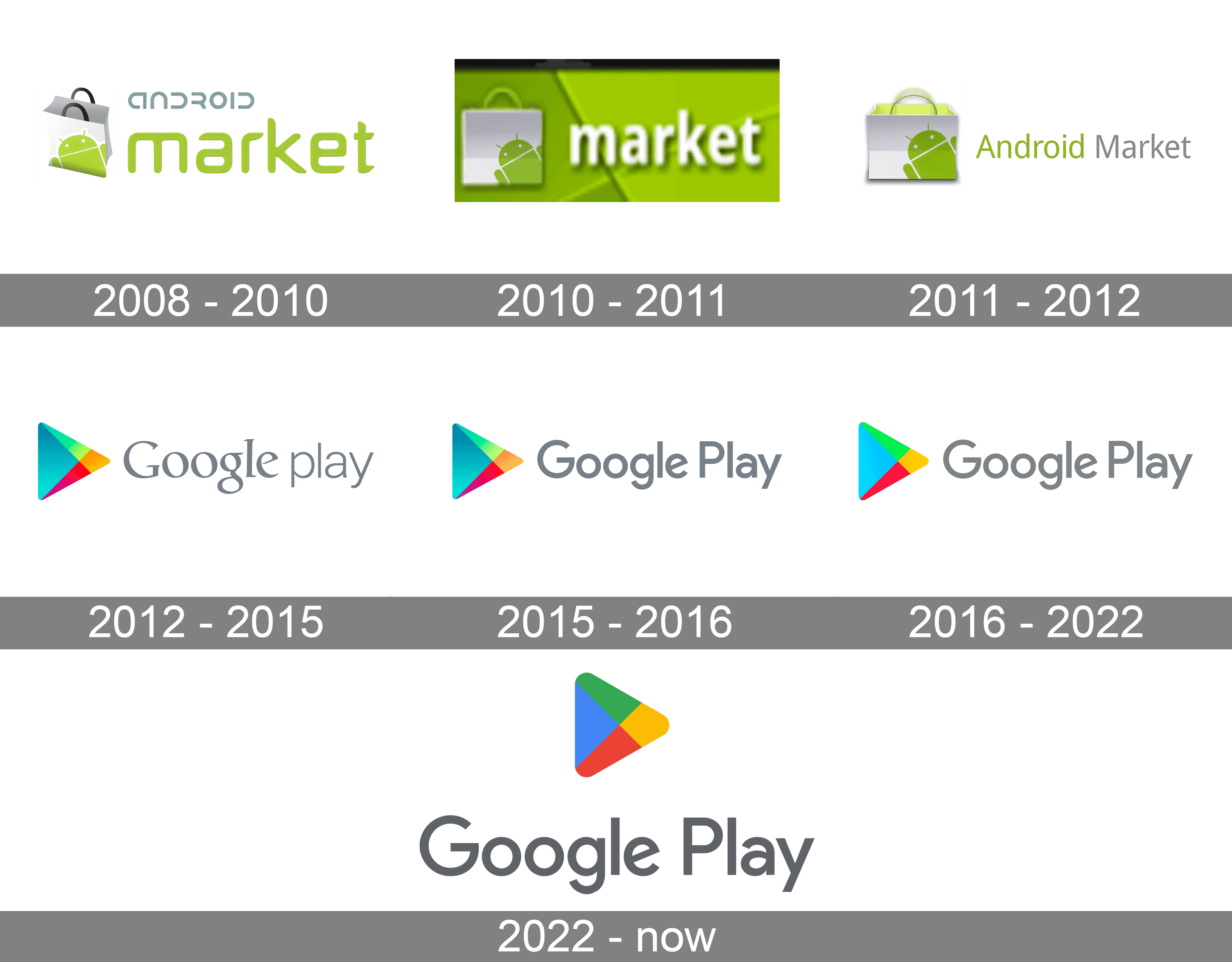
The Google Play logo has undergone numerous changes since it was first introduced in 2012. The original logo featured the iconic Android mascot holding a shopping bag, expressing the store-like essence of the platform.
In 2013, the logo’s design was simplified to feature just the word “Play” in a distinctive font accompanied by a series of colorful bars above the word. This version of the logo still conveyed a sense of playfulness and variety, but in a more minimalistic way.
In 2014, Google introduced another design update to the Google Play logo. This design was a significant departure from its predecessor, featuring the triangular logo we know today. The new logo was cohesive with the overall design language of Google’s other products at the time and was a reflection of the company’s design philosophy of “Material Design.”
In 2019, Google introduced another refresh of the Google Play logo to reflect a more modern and minimalistic approach. The design was simplified further and featured a solid triangle with the multicolored arcs replaced with four elements: apps & games, movies & TV, music, and books.
The Meaning Behind the Logo
The meaning behind the Google Play logo is central to its overall design. The multicolored arcs symbolize the various types of content available on the platform, ranging from apps and games to music and movies. The transparent colors represent the content’s depth and diversity, appealing to users with different interests.
The triangle-shaped icon symbolizes stability, innovation, and forward-thinking. The shape’s sharp edges convey a sense of precision and sophistication. The “play” button symbol within the triangle indicates the platform’s focus on entertainment and enjoyment.
The Importance of the Google Play Logo
The Google Play logo is more than just a simple design element; it also carries significant brand recognition and value. The logo establishes trust and familiarity with users, indicating that they can find quality, reliable content on Google Play.
Brand recognition is becoming increasingly important in today’s crowded marketplaces. The Google Play logo is among the most recognized logos globally, and its design inspires feelings of innovation, quality, and excitement.
Conclusion
The Google Play logo represents a digital marketplace that offers a vast array of entertainment and productivity options for Android users. The logo’s design is central to its significance, with the multicolored arcs, triangle shape, and “play” symbol all contributing to its unique identity. The evolution of the logo from its original form to its present iteration reflects Google’s commitment to making refined and modern designs for its products.
All in all, the Google Play logo is a simple yet effective design that resonates with Android users worldwide and is a powerful symbol of the platform’s brand identity.
Download Google Play Logo PNG images transparent gallery
- Google Play Logo Transparent
Resolution: 1042 × 1042
Size: 111 KB
Image Format: .png
Download
- Google Play Logo
Resolution: 256 × 256
Size: 4 KB
Image Format: .png
Download
- Google Play Logo No Background
Resolution: 2000 × 2199
Size: 22 KB
Image Format: .png
Download
- Google Play Logo PNG Clipart
Resolution: 3840 × 2160
Size: 67 KB
Image Format: .png
Download
- Google Play Logo PNG Cutout
Resolution: 1836 × 2047
Size: 143 KB
Image Format: .png
Download
- Google Play Logo PNG File
Resolution: 300 × 156
Size: 10 KB
Image Format: .png
Download
- Google Play Logo PNG Free Image
Resolution: 3840 × 2160
Size: 83 KB
Image Format: .png
Download
- Google Play Logo PNG HD Image
Resolution: 3840 × 2160
Size: 60 KB
Image Format: .png
Download
- Google Play Logo PNG Image File
Resolution: 3840 × 2160
Size: 26 KB
Image Format: .png
Download
- Google Play Logo PNG Image HD
Resolution: 438 × 474
Size: 39 KB
Image Format: .png
Download
- Google Play Logo PNG Image
Resolution: 1024 × 202
Size: 28 KB
Image Format: .png
Download
- Google Play Logo PNG Images HD
Resolution: 896 × 1003
Size: 67 KB
Image Format: .png
Download
- Google Play Logo PNG Images
Resolution: 360 × 360
Size: 14 KB
Image Format: .png
Download
- Google Play Logo PNG Photo
Resolution: 2560 × 588
Size: 103 KB
Image Format: .png
Download
- Google Play Logo PNG Photos
Resolution: 256 × 256
Size: 25 KB
Image Format: .png
Download
- Google Play Logo PNG Pic
Resolution: 512 × 512
Size: 28 KB
Image Format: .png
Download
- Google Play Logo PNG Picture
Resolution: 3840 × 3000
Size: 248 KB
Image Format: .png
Download
- Google Play Logo PNG
Resolution: 300 × 216
Size: 10 KB
Image Format: .png
Download
