Download top and best high-quality free H&M Logo PNG Transparent Images backgrounds available in various sizes. To view the full PNG size resolution click on any of the below image thumbnail.
License Info: Creative Commons 4.0 BY-NC
If you’ve ever shopped at H&M, you’ve probably noticed their iconic logo. But have you ever wondered about the meaning behind it?
The H&M logo is a simple, yet powerful design that has become instantly recognizable all over the world. It consists of two letters – H and M – written in white against a bright red background. The font used for the letters is a custom typeface, which was designed specifically for H&M. The logo was introduced in 1974 and has remained largely unchanged since then.
The Meaning Behind the Logo
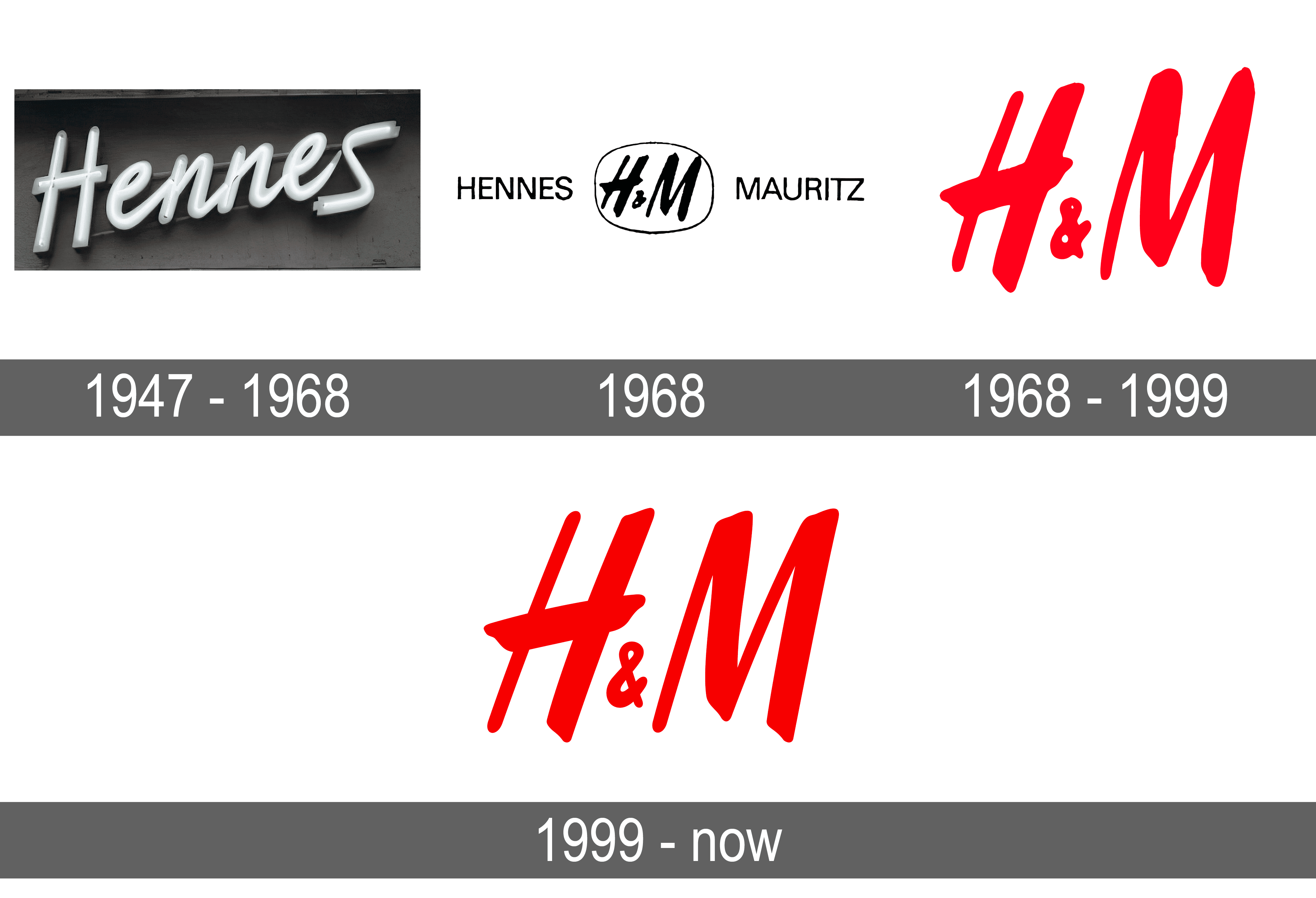
The H and M in the logo represent the initials of the two founders of the company – Erling Persson and his wife, Helene Persson. The company was originally called “Hennes”, which means “Hers” in Swedish. It was a women’s clothing store that sold affordable fashion. In 1968, the company acquired a hunting and fishing store called “Mauritz Widforss” and changed its name to “Hennes & Mauritz”. The logo was then redesigned to incorporate the two names.
The red background of the logo is meant to convey energy and passion. Red is a strong and bold color that is often associated with power and confidence. It is also a color that is commonly used in the fashion industry, so it makes sense that H&M would choose it for their logo.
The Evolution of the Logo
Although the basic design of the H&M logo has remained the same for over 40 years, there have been some minor changes and updates along the way. In the early 2000s, the logo was updated to make it more modern and streamlined. The letters were made slightly thinner, and the spacing between them was adjusted. The red background also became brighter and more vibrant.
In recent years, H&M has experimented with different versions of their logo for special collaborations and collections. For example, in 2018, they created a logo featuring the slogan “Love For All” for their Pride campaign. The rainbow-colored logo was a departure from their typical red and white design but was still instantly recognizable as H&M.
The Impact of the H&M Logo
The H&M logo is one of the most recognizable fashion logos in the world. It is synonymous with affordable, trendy fashion and has been worn by millions of people around the globe. The logo has been used on everything from clothing and accessories to marketing materials and store signage.
For H&M, the logo represents their brand identity and all that they stand for – affordable fashion that is inclusive and accessible to everyone. The logo has helped to build a strong and loyal customer base, and has played a key role in the company’s success over the years.
The Future of the Logo
As H&M continues to evolve and grow, it’s likely that we will see further updates to their logo. As fashion trends change and technology advances, the logo may need to be adapted to stay relevant. However, it’s likely that the basic design and color scheme of the logo will remain the same, as it has become such an integral part of the company’s identity.
Overall, the H&M logo is a timeless design that has stood the test of time. It is a powerful symbol of the brand’s values and mission, and will continue to be an important part of their identity for years to come.
Download H&M Logo PNG images transparent gallery
- H&M Logo
Resolution: 1280 × 843
Size: 73 KB
Image Format: .png
Download
- H&M Logo No Background
Resolution: 2400 × 2400
Size: 23 KB
Image Format: .png
Download
- H&M Logo PNG Clipart
Resolution: 640 × 202
Size: 6 KB
Image Format: .png
Download
- H&M Logo PNG Cutout
Resolution: 3840 × 2621
Size: 246 KB
Image Format: .png
Download
- H&M Logo PNG File
Resolution: 2560 × 1686
Size: 162 KB
Image Format: .png
Download
- H&M Logo PNG Free Image
Resolution: 1535 × 1127
Size: 23 KB
Image Format: .png
Download
- H&M Logo PNG HD Image
Resolution: 1200 × 1200
Size: 258 KB
Image Format: .png
Download
- H&M Logo PNG Image HD
Resolution: 2400 × 2400
Size: 53 KB
Image Format: .png
Download
- H&M Logo PNG Image
Resolution: 4048 × 532
Size: 87 KB
Image Format: .png
Download
- H&M Logo PNG Images HD
Resolution: 300 × 222
Size: 9 KB
Image Format: .png
Download
- H&M Logo PNG Images
Resolution: 2400 × 2400
Size: 91 KB
Image Format: .png
Download
- H&M Logo PNG Photo
Resolution: 3840 × 2400
Size: 59 KB
Image Format: .png
Download
- H&M Logo PNG Photos
Resolution: 300 × 300
Size: 9 KB
Image Format: .png
Download
- H&M Logo PNG Pic
Resolution: 1280 × 1024
Size: 19 KB
Image Format: .png
Download
- H&M Logo PNG Picture
Resolution: 408 × 249
Size: 66 KB
Image Format: .png
Download
- H&M Logo PNG
Resolution: 2560 × 1856
Size: 107 KB
Image Format: .png
Download
- H&M Logo Transparent
Resolution: 3840 × 2160
Size: 113 KB
Image Format: .png
Download


