Download top and best high-quality free Bratz Logo PNG Transparent Images backgrounds available in various sizes. To view the full PNG size resolution click on any of the below image thumbnail.
License Info: Creative Commons 4.0 BY-NC
The Bratz Logo is a well-known and recognizable design that is synonymous with the Bratz dolls franchise. The brand was launched in 2001 by MGA Entertainment and quickly became a sensation thanks to its sassy and trendy fashion doll characters.
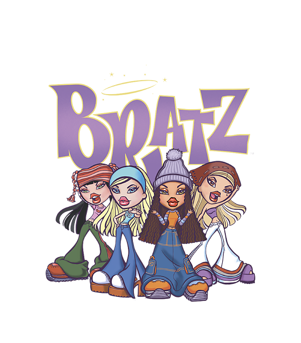
The Bratz Logo features a stylized depiction of one of the main Bratz dolls. The logo is composed of a bold and modern font, combined with a graphic element that showcases one of the four Bratz dolls – Cloe, Yasmin, Sasha, and Jade. The graphic element is usually set inside a diamond shape, which is the signature shape of the Bratz dolls.
The Bratz Logo has undergone several iterations and updates over the years, as the brand has evolved and grown. However, the core elements of the logo have remained consistent, ensuring that fans can always recognize and identify the Bratz brand.
The Story Behind the Bratz Logo
When MGA Entertainment created the Bratz dolls, they wanted to create a brand that would stand out from the other dolls on the market. The company’s founder, Isaac Larian, was inspired by the street fashion he saw in Los Angeles and wanted to incorporate that edgy and trendy aesthetic into the dolls.
The Bratz dolls were designed to be more than just toys – they were meant to be a reflection of the times and a celebration of diversity, empowerment, and individuality. The dolls were designed to be sassy, confident, and full of attitude, with bold makeup, colorful hairstyles, and chic clothes that were inspired by real-life fashion trends.
To convey that same sense of personality and style in the branding, MGA Entertainment created the Bratz Logo. The logo was designed to be eye-catching, bold, and modern, just like the dolls themselves. The diamond shape was chosen because it represents luxury and quality, while the graphic element showcases the individuality and diversity of the Bratz dolls.
Over the years, the Bratz Logo has evolved to keep up with changing trends and styles. However, the basic design elements have remained constant, ensuring that the logo remains instantly recognizable and synonymous with the Bratz dolls franchise.
The Evolution of the Bratz Logo
The Bratz Logo has undergone several changes since it was first introduced in 2001. The most significant change came in 2015 when MGA Entertainment rebranded the franchise as “Bratz Collector’s Edition.” The new branding was meant to appeal to older fans of the brand, and the logo was updated to reflect that more sophisticated and fashion-forward aesthetic.
The 2015 version of the Bratz Logo features a more detailed graphic element, with a three-dimensional rendering of one of the Bratz dolls. The font is also slightly more refined, with sharper lines and a bolder look. This version of the logo was used for several years until MGA Entertainment released a new iteration in 2020.
The 2020 version of the Bratz Logo is a complete departure from the previous designs. The logo features a new, more modern font, with a sleek and minimalist look. The graphic element has also been updated, with a simplified image of one of the Bratz dolls. The diamond shape is still present, but it has been resized and repositioned to create a more streamlined and contemporary appearance.
The updated logo reflects the current trends in design and branding, with a focus on simplicity, minimalism, and clean lines. The new logo is also more versatile, making it easier to use across various platforms and media types.
The Meaning Behind the Bratz Logo
The Bratz Logo is more than just a simple design element – it is a symbol of the brand’s core values and identity. The diamond shape represents luxury and quality, while the graphic element celebrates diversity, individuality, and empowerment.
The Bratz dolls themselves were designed to be a representation of real-life girls. Each of the four main dolls has a distinct personality, style, and backstory. By showcasing one of the dolls in the logo, MGA Entertainment is highlighting the diversity and individuality of the brand.
The font used in the Bratz Logo is bold, modern, and eye-catching. It reflects the confidence and attitude of the Bratz dolls and the brand as a whole. The font is also easy to read and recognizable, making it an ideal choice for branding and marketing purposes.
The Bratz Logo is a highly recognizable and iconic design that serves as a symbol of the brand’s core values and identity. The logo has evolved over the years to keep up with changing trends and styles, but the basic design elements have remained consistent. The Bratz Logo represents diversity, individuality, empowerment, and luxury, all of which are core values of the brand. Overall, the Bratz Logo is a testament to the power of strong branding and design, and it continues to be a beloved and recognizable symbol of the Bratz dolls franchise.
Download Bratz Logo PNG images transparent gallery
- Bratz Logo PNG Photos
Resolution: 600 × 685
Size: 292 KB
Image Format: .png
Download
- Bratz Logo PNG Pic
Resolution: 1200 × 628
Size: 181 KB
Image Format: .png
Download
- Bratz Logo PNG Picture
Resolution: 2248 × 1329
Size: 552 KB
Image Format: .png
Download
- Bratz Logo PNG
Resolution: 1280 × 690
Size: 226 KB
Image Format: .png
Download
- Bratz Logo Transparent
Resolution: 300 × 192
Size: 69 KB
Image Format: .png
Download
- Bratz Logo
Resolution: 300 × 300
Size: 93 KB
Image Format: .png
Download
- Bratz Logo No Background
Resolution: 1473 × 790
Size: 849 KB
Image Format: .png
Download
- Bratz Logo PNG Clipart
Resolution: 700 × 350
Size: 236 KB
Image Format: .png
Download
- Bratz Logo PNG Cutout
Resolution: 3840 × 2160
Size: 1215 KB
Image Format: .png
Download
- Bratz Logo PNG File
Resolution: 794 × 390
Size: 336 KB
Image Format: .png
Download
- Bratz Logo PNG Free Image
Resolution: 929 × 588
Size: 422 KB
Image Format: .png
Download
- Bratz Logo PNG HD Image
Resolution: 2248 × 1329
Size: 191 KB
Image Format: .png
Download
- Bratz Logo PNG Image HD
Resolution: 1576 × 440
Size: 438 KB
Image Format: .png
Download
- Bratz Logo PNG Image
Resolution: 279 × 380
Size: 40 KB
Image Format: .png
Download
- Bratz Logo PNG Images HD
Resolution: 400 × 268
Size: 162 KB
Image Format: .png
Download
- Bratz Logo PNG Images
Resolution: 3840 × 2160
Size: 124 KB
Image Format: .png
Download
- Bratz Logo PNG Photo
Resolution: 279 × 380
Size: 12 KB
Image Format: .png
Download
