Download top and best high-quality free Dr Pepper Logo PNG Transparent Images backgrounds available in various sizes. To view the full PNG size resolution click on any of the below image thumbnail.
License Info: Creative Commons 4.0 BY-NC
For over a century, Dr Pepper has been one of the most popular soft drinks in the United States. It’s unique blend of 23 different flavors sets it apart from other soda brands out in the market. However, did you ever think about the origin or design of the Dr Pepper logo?
The History of the Dr Pepper Logo
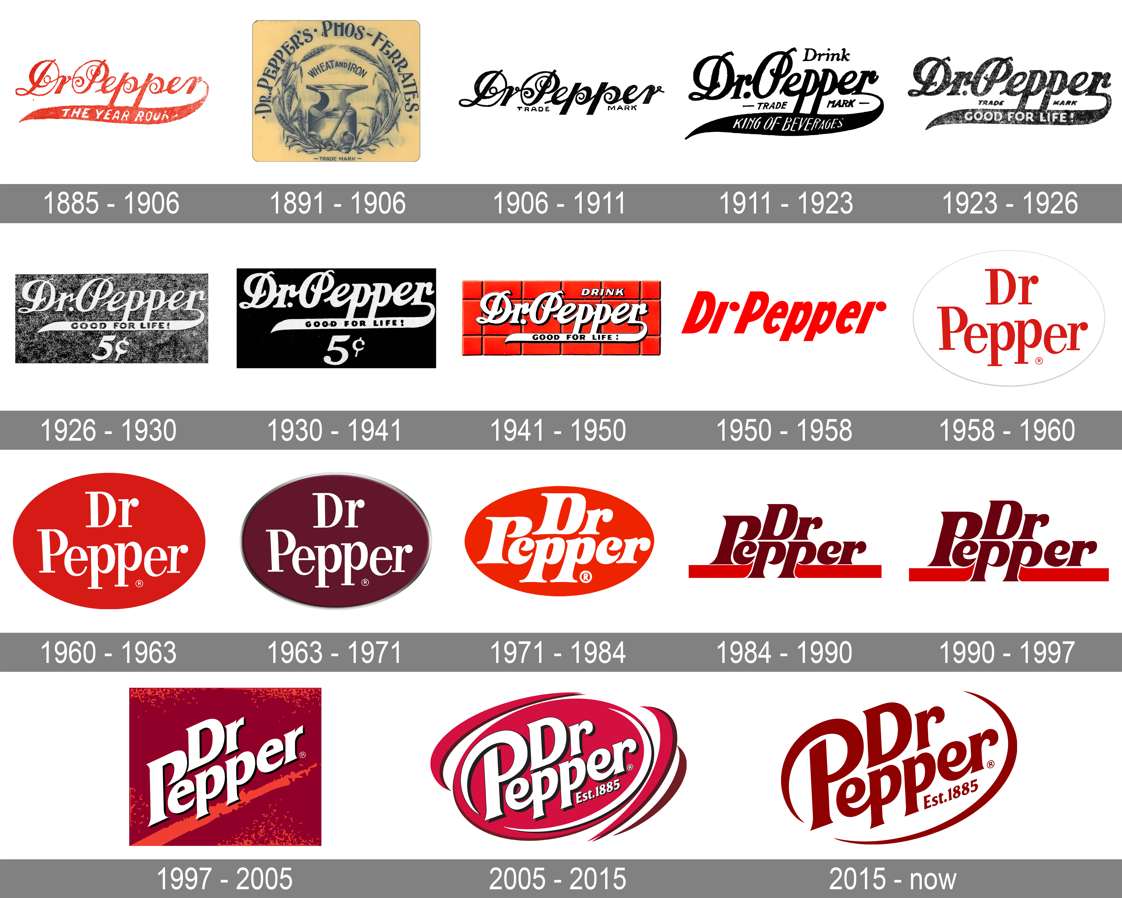
The very first Dr Pepper logo was introduced in 1891, when the drink was still being produced in Waco, Texas. It featured an old-fashioned, elegant script font that said “Dr. Pepper Syrup and Extract” in black with a red background. It was simple yet elegant and helped differentiate the brand from other soft drinks on the market.
In 1906, the logo underwent a redesign, and the word “Doctor” was abbreviated to “Dr.”, giving way to the classic “Dr Pepper” name we know today. The font of the logo remained the same but was enlarged to give more prominence to the brand name.
As the drink’s popularity grew, so did its logo. In 1958, Dr Pepper introduced a new logo that included a circle surrounding the brand name with the phrase “Good for life” appearing above it. The words “King of Beverages” were also included below the brand name, lending a royal quality to the drink.
In 1970, Dr Pepper introduced what is now known as the “Free Shape” logo, which featured a stamp-like design that could be used for branding purposes. This design was used extensively in advertising and merchandise, including clothing, hats, and other branded products that helped increase the brand’s visibility.
With the advent of digital technology, Dr Pepper introduced a new logo in 2006-2007 that is more modern and slick than its predecessors. The current logo features a solid red background with bold white sans-serif font, prominently displaying the brand name. The “10, 2, and 4” slogan, which was used in various advertising campaigns over the years, also appears under the brand name on the logo.
The Design Elements of the Dr Pepper Logo
The Dr Pepper logo is instantly recognizable, thanks to its bold color choice and sleek font design. Here are some design elements that make the logo standout:
- Color – The color red dominates the Dr Pepper logo, making it stand out in a crowded space. Red is also commonly associated with emotions such as excitement and passion, making it an appropriate choice for a brand that aims to provide fun and enjoyment to its customers.
- Font – The sans-serif font style used in the logo is modern and simple, yet bold enough to catch the attention of viewers. It is also easy to read, making it a perfect choice for a logo that will be used on small packaging and labels.
- Shape – The rectangular shape of the logo gives it a modern, professional look that stands out from other soft drink logos that use circular designs. The straight edges and neat lines convey stability and reliability.
Conclusion
The Dr Pepper logo has changed significantly over the years, but its core design principles have remained constant. The use of bold colors, a modern font, and a distinctive shape has helped Dr Pepper build a recognizable and iconic visual identity that has stood the test of time. The next time you enjoy a Dr Pepper, take a closer look at its logo, and appreciate the hard work and thought that went into its design.
Download Dr Pepper Logo PNG images transparent gallery
- Dr Pepper Logo PNG Pic
Resolution: 602 × 494
Size: 67 KB
Image Format: .png
Download
- Dr Pepper Logo PNG Picture
Resolution: 300 × 251
Size: 23 KB
Image Format: .png
Download
- Dr Pepper Logo PNG
Resolution: 3000 × 2000
Size: 35 KB
Image Format: .png
Download
- Dr Pepper Logo Transparent
Resolution: 2400 × 1850
Size: 244 KB
Image Format: .png
Download
- Dr Pepper Logo
Resolution: 250 × 250
Size: 14 KB
Image Format: .png
Download
- Dr Pepper Logo No Background
Resolution: 1548 × 459
Size: 43 KB
Image Format: .png
Download
- Dr Pepper Logo PNG Clipart
Resolution: 2400 × 1717
Size: 161 KB
Image Format: .png
Download
- Dr Pepper Logo PNG Cutout
Resolution: 3840 × 2160
Size: 881 KB
Image Format: .png
Download
- Dr Pepper Logo PNG File
Resolution: 3840 × 2416
Size: 53 KB
Image Format: .png
Download
- Dr Pepper Logo PNG HD Image
Resolution: 3840 × 2160
Size: 54 KB
Image Format: .png
Download
- Dr Pepper Logo PNG Image HD
Resolution: 4096 × 4096
Size: 555 KB
Image Format: .png
Download
- Dr Pepper Logo PNG Image
Resolution: 3840 × 3075
Size: 676 KB
Image Format: .png
Download
- Dr Pepper Logo PNG Images
Resolution: 300 × 143
Size: 9 KB
Image Format: .png
Download
- Dr Pepper Logo PNG Photo
Resolution: 1600 × 1000
Size: 566 KB
Image Format: .png
Download
- Dr Pepper Logo PNG Photos
Resolution: 500 × 281
Size: 10 KB
Image Format: .png
Download

